Filters
Every number on the page follows the filters at the top:- Date range — the last 28 days by default. Pick a preset (last 7, 14 or 28 days, this month, previous month, quarter, year) or any two days on the calendar. Each figure is compared with the period of the same length just before it.
- Model — all five assistants together, or one at a time.
- Segment — all prompts, or just one of your segments.

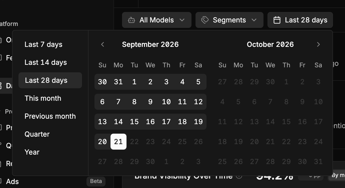
The date range: presets on the left, or any two days on the calendar.
Headline figures

The screenshots on these pages come from a project tracking Notion in the US, on all five assistants.
Over time
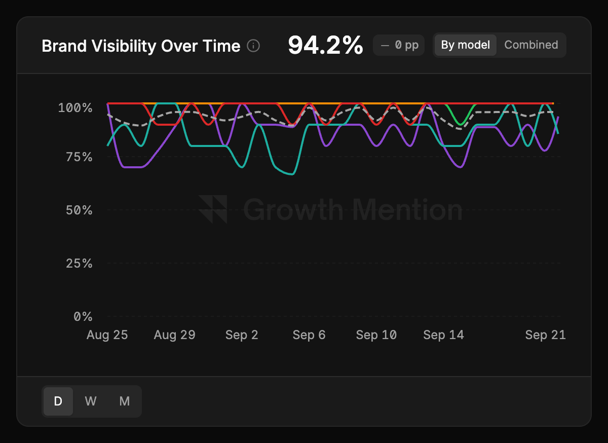
Brand Visibility Over Time and Source Score Over Time chart those two figures over the date range. Each chart has two switches:- By model / Combined — one line per assistant, or a single line for all of them together. By model shows which assistant is moving; Combined shows the overall trend.
- D / W / M at the bottom — one point per day, week or month. Weekly and monthly points smooth out day-to-day noise on long ranges.
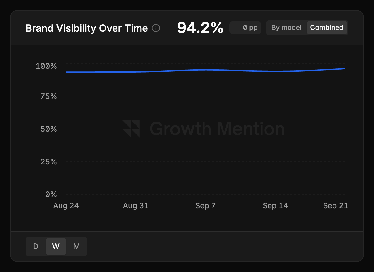
The same chart switched to Combined, one point per week.
Visibility by model
A table of the leading brands against each assistant, showing each brand’s visibility on each one. Your brand is always the first row. This is where the assistants’ disagreements show: the same brand can lead on ChatGPT and be missing from Perplexity. Brands are ordered by their best showing on any single assistant, so a brand that dominates one assistant isn’t hidden by a low average.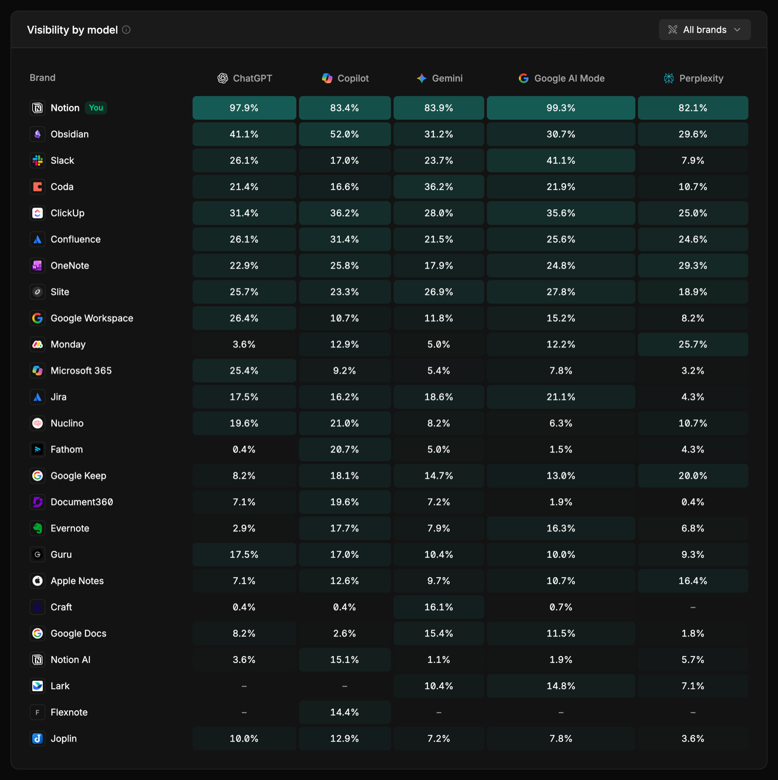
Share of Voice by Ownership
Every brand mention split three ways: your brands, competitors, and everyone else. It’s only as sharp as your markings — mark competitors, your own brand and your other products on the Competitors page. See Brands and competitors.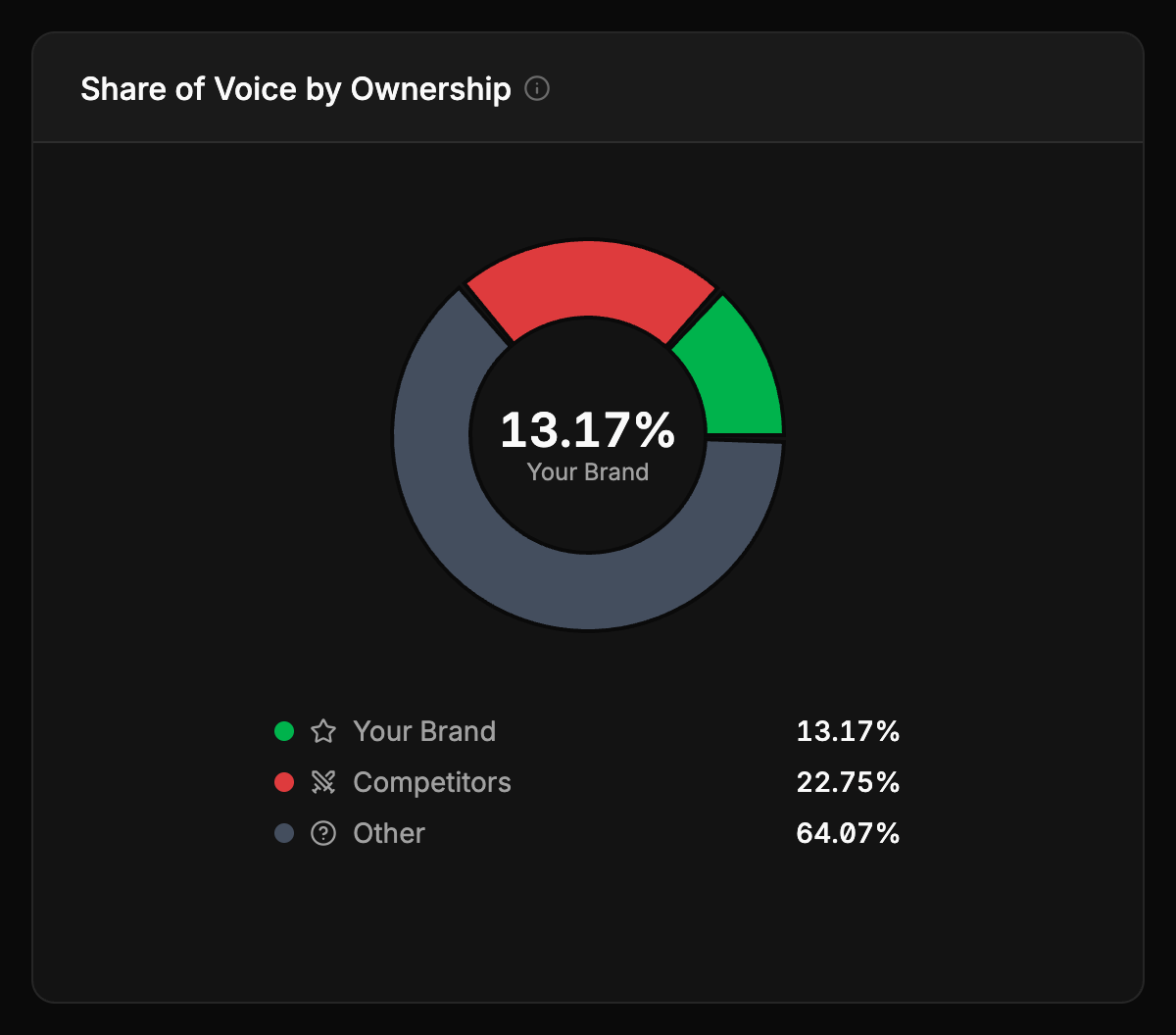
Competitor Analysis
The brands the answers name most, ranked by visibility, with each one’s average position and share of voice. The full list, and the controls for marking brands, are on the Competitors page. You can export it as CSV from here — see Sharing and export.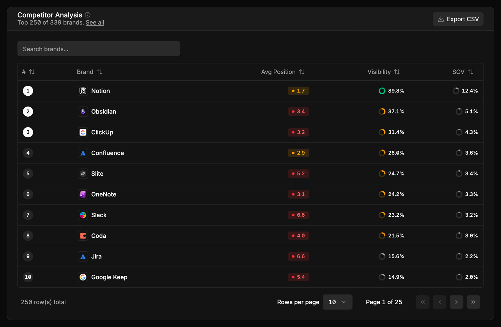
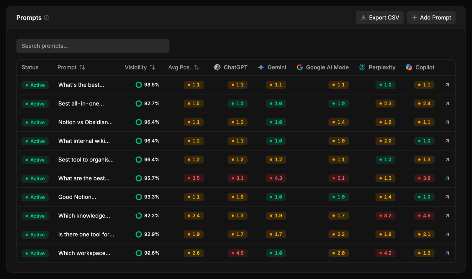
Prompts
Each prompt with your visibility and average position on it. Sort by visibility to find the questions where you’re missing, then click a prompt to read its answers.